What is the Arsenal logo's meaning?
Founded in 1886 by a group of munitions workers at the Royal Arsenal in Woolwich, Arsenal Football Club has navigated 140 years of history to become a global sporting powerhouse. Originally named Dial Square, the club was established by David Danskin and his colleagues, who drew inspiration from their workplace, the heart of Britain's military manufacturing.
In their earliest days, the team donned dark red shirts, a color choice provided by Nottingham Forest, and adopted a crest that was a direct tribute to their surroundings. This first emblem, used until 1922, featured 3 vertical cannons topped with lions' heads, mirroring the Woolwich Borough coat of arms.
The decision to incorporate weaponry instead of traditional local animals or landmarks was a deliberate statement of power and origin. The Arsenal logo meaning thus became inseparable from the "Gunners" moniker, signaling a fierce, "don't-mess-with-us" attitude. To this day, the red fabric and the cannon remain the DNA of the club, a genetic blueprint of resilience and precision.
As we delve deeper into this journey with Flashscoremobi, it becomes clear that for Arsenal, the logo is not just a brand; it is a battle standard carried into the modern sporting arena.
What is the Arsenal logo meaning?
The Arsenal logo was born in the smoke and steel of 1905, when the first official crest appeared in the "Book of Football." This intricate design featured the Latin motto ‘CLAMANT NOSTRA TELA IN REGIS QUERELA’, translating to "Our weapons clash in the King’s quarrel." It was a grand, ornate symbol that highlighted the civic pride of a military-dominated borough. During this era, the club played a robust, physical game typical of Victorian football, establishing themselves as a force in the Southern League before joining the Football League.
However, as the club moved North to Highbury in 1913, the identity needed to sharpen. By 1922, a new era of minimalism dawned. The club introduced a single, eastward-pointing cannon in a horizontal oval. This "robust" weapon lasted only three seasons before the legendary Herbert Chapman took the reins in 1925.
Chapman, a visionary who revolutionized football management, reverted the cannon to a westward-pointing orientation. Under his guidance, Arsenal became the dominant force of the 1930s. This period saw the "WM" formation take flight, leading to 5 league titles and 2 FA Cups.
Iconic players like Alex James and Cliff Bastin defined a philosophy of devastating counter-attacks and tactical superiority. Bastin, in particular, was a revelation, scoring 178 goals for the club, a record that stood for decades. The spirit of these "Invincibles" of the 1930s perfectly mirrored the "Gunners" identity: clinical, organized, and unstoppable.
In the midst of this golden age, a different kind of innovation emerged. The Art Deco crest, featuring the letters "A", "F", and "C" intertwined within a hexagon, was inlaid into the floors of Highbury’s Marble Halls. Designed by architect Claude Waterlow Ferrier alongside Chapman, this symbol represented the synthesis of architecture and sport. It was sleek, modern, and forward-thinking, much like the club’s record-breaking 1930/31 season where they won the league with 66 points, scoring a staggering 127 goals.
Transitioning into the post-war era, the most enduring version of the logo was born in 1949: the Victoria Concordia Crescit (VCC) crest. The phrase, meaning "Victory grows out of harmony," was coined by program editor Harry Homer. This shield featured a westward-facing cannon and the coat of arms of the Borough of Islington.
Under manager Tom Whittaker, Arsenal continued its winning tradition, securing the league title in 1952/53. The VCC crest presided over some of the most historic moments in English football, including the 1970/71 Double-winning season under Bertie Mee. In that magical year, players like Charlie George and Frank McLintock displayed a relentless fighting spirit, winning 29 out of 42 league matches.
The logo, which remained largely unchanged for 53 years, witnessed the rise of the "Invincibles" of 2003/04 under Arsène Wenger. Thierry Henry, the crown jewel of that era, scored 30 league goals in a season where Arsenal went 38 games unbeaten, a record that still stands as the pinnacle of Premier League achievement.
The dawn of the 21st century brought the current, streamlined logo in 2002. Facing the hallowed East once more, the bold gold cannon represents a club looking toward a new horizon at the Emirates Stadium. This "laconic" design stripped away the ornate ribbons of the past to focus on the core symbol: the cannon.
During its debut season (2002/03), Arsenal played a breathtaking brand of attacking football, winning the FA Cup and finishing second in the league with a 60% win rate. Players like Robert Pires and Patrick Vieira embodied the "Victory through Harmony" philosophy, blending physical power with artistic grace.
Finally, the 125th-anniversary crest in 2011/12 served as a beautiful synthesis of old and new. It featured 15 laurel leaves for the founding members and 15 oak leaves for the Royal Oak pub where they met. The motto "Forward" sat beneath the crest, echoing the club's relentless pursuit of progress.
Chronology of the Arsenal crest evolution:
1905 - 1922: The Original Woolwich Borough crest with three vertical cannons and lions' heads.
1922 - 1925: A simplified single eastward-pointing cannon within an oval frame.
1925 - 1949: The westward-pointing "narrow" cannon, synonymous with the Chapman era.
1932 - 1952: The Hexagonal Art Deco "AFC" symbol used for branding and architectural inlay.
1949 - 2002: The iconic Victoria Concordia Crescit shield featuring the Islington coat of arms.
1967 - 1978: A minimalist white cannon silhouette on a solid red background used on kits.
2002 - present: The modern, gold eastward-pointing cannon with a simplified shield.
2011 - 2012: The 125th Anniversary commemorative design featuring laurel and oak leaves.
We hope this comprehensive exploration by Flashscoremobi.com helps you gain a multi-dimensional perspective and a deeper understanding of the Arsenal logo's meaning. Behind the silhouette of the cannon lie heroic pages of history, etched into the hearts of players so they never forget their roots or the identity that leads to success.
Beyond the stories of the "Gunners," exploring lesser-known leagues, clubs, and fascinating football facts is a project that Flashscoremobi is committed to expanding in the future. If you find these insights captivating, do not hesitate to make our website your favorite destination for sports entertainment. Alongside in-depth articles, Flashscoremobi provides a modern sports experience with a platform that continuously updates match schedules for the planet's top leagues, live developments, results, and detailed statistical analysis before and after every whistle.
The Most Popular
-
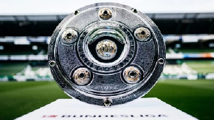 How many games are there in a Bundesliga season per team?
 -
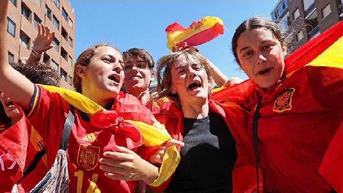 Why is football so popular in Spain?
 -
 6 Brazil's biggest wins in football history: The shocking 9-goal thrashing of Argentina
 -
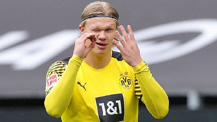
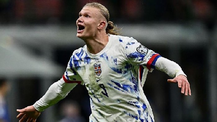 Ranking the 5 dark horses for the 2026 World Cup: Waiting for Haaland’s debut, 2 Asian teams to watch
 -
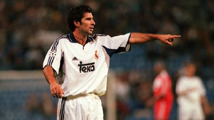 10 football players who played for Real Madrid and Barcelona: Figo the “traitor”, Eto'o’s costly mistake
 -
 What position does Erling Haaland play?
 -
 Brazil national football team squad for the 2026 World Cup predicted: Casemiro’s last shot, Neymar in the spotlight
 -
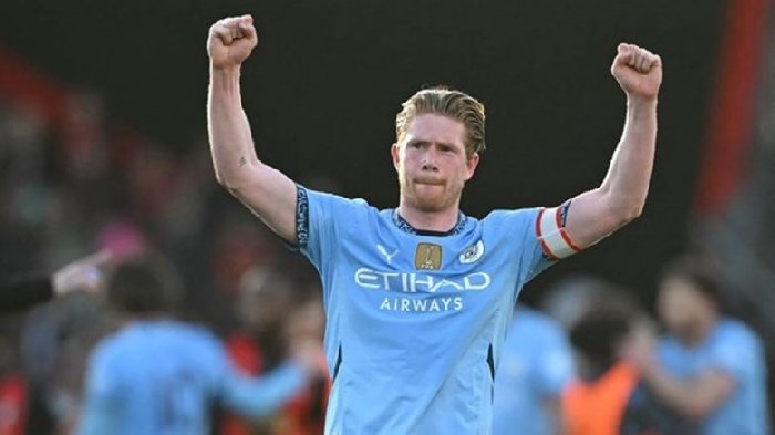 Why did De Bruyne leave Man City?
 -
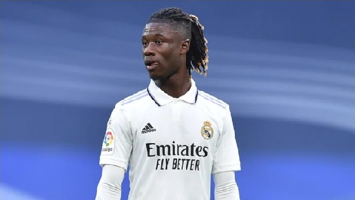 How much did Real Madrid pay for Camavinga?
 -
 How much did Real Madrid pay for Eden Hazard?